GM Web Resources
We are part of a large team made up of designers, developers, marketers, researchers, analysts, and strategists.
Sharing information is essential to what we do.
Have a question?
We’re here whenever you need us.


When Your Branding Finally Comes Together: A Case Study
Cohesive branding is when everything feels like it belongs to the same organization, no matter where someone comes across it. It’s not just about matching colors or using the same font. It’s about creating a consistent experience. When your fundraising email looks totally different from your website, or each event flyer has a new style, it can leave people unsure about who you are and what to expect.
At GM Web Services, we help businesses and organizations bring all their brand pieces into alignment, so they tell one clear story, not ten different ones.
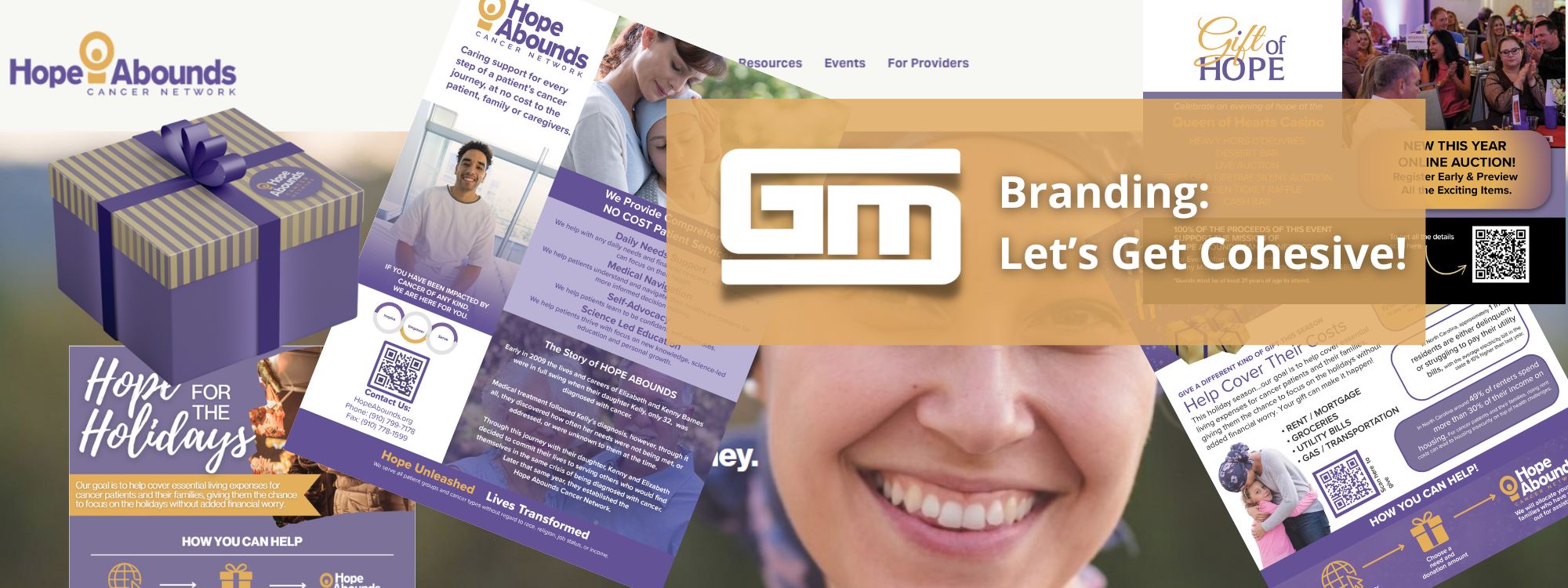
Here’s what that looked like in a recent project with Hope Abounds Cancer Network, a North Carolina nonprofit that provides emotional and spiritual support to individuals and families facing cancer.
The Challenge
Hope Abounds already had a lot in place, a strong mission, a website, a logo, and active social media. But each part felt like it was doing its own thing. Flyers didn’t match the tone of the website. Emails looked different from event promotions. The overall message of hope, faith, and support wasn’t always coming through.
It wasn’t a branding problem; it was a branding consistency problem. So we stepped in, not to start over, but to bring everything together.
Step One: Make Their Events Instantly Recognizable
Fundraising is a big part of Hope Abounds’ mission. But before we got involved, each event flyer looked completely different, from layout to tone to color. We created a flexible visual system they could reuse across events, with:
- A shared color palette and design style
- Easy-to-read layouts that highlight the “what/where/when”
- Visuals that carried across flyers, emails, and social media
Now, when someone sees a Hope Abounds event, they know exactly who it’s from, even before reading the name.
Step Two: Create Branded Email Templates That Feel Familiar
Next, we tackled their emails. We designed templates that aligned with their event materials and website so that everything felt like it came from the same voice and brand.
This kind of alignment might sound small, but it makes a big difference. People recognize and trust brands that show up the same way every time.
Step Three: Design Patient Newsletters with the Right Tone
Some of Hope Abounds’ communication is more personal, like newsletters sent directly to patients and families. We created a simplified newsletter style that felt calm, warm, and supportive, while still fitting into the overall brand. It was important that these messages felt easy to read and emotionally appropriate for the audience.
Why It Worked
We didn’t redesign their logo. We didn’t overhaul their website. We simply connected the dots. By aligning the pieces, they already had, we helped Hope Abounds present a more unified, recognizable, and trustworthy brand, one that reflects who they are at every touchpoint.
What This Means for YOUR Brand
No matter your size or industry, cohesive branding can help you:
- Build recognition and trust
- Communicate with more clarity and confidence
- Save time using repeatable systems and templates
- Make a stronger impression that actually sticks
If your brand feels a little scattered, you’re not alone, and you don’t need to start from scratch. You just need your pieces to work better together.
See the full project here: Hope Abounds Cancer Network
Contact us to explore how we can help bring your branding together.


